ux + ui + visual design • art direction
year: 2013 • project length: 6 months • platform: ios/android
Swipe was a dating app developed, during my time with Backbeat Networks, in which the intent of the product was to take the staid tried-but-true and add a playful, human touch. Even the app's name, which I at first coined and was ultimately chosen by the client, is a bit of cheek on a couple levels. I lead efforts on UX, wrote copy, and was wholly responsible for visual design.
Problems to Solve
• Create a fun and light take on the dating app
• Improve first time user experience
• Close but not too close
Process toward Solutions
Our client came to us with a perfunctory dating site with which they had already achieved a substantial user base. They wanted to parlay this achievement into a fresh, but familiar, mobile experience. To achieve a fun, airy feeling I chose a predominantly white palette that featured a handful of bright colors that would pop on screen.
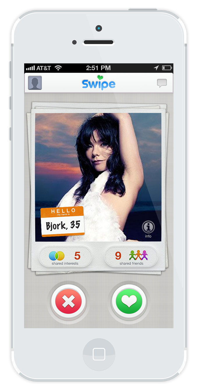
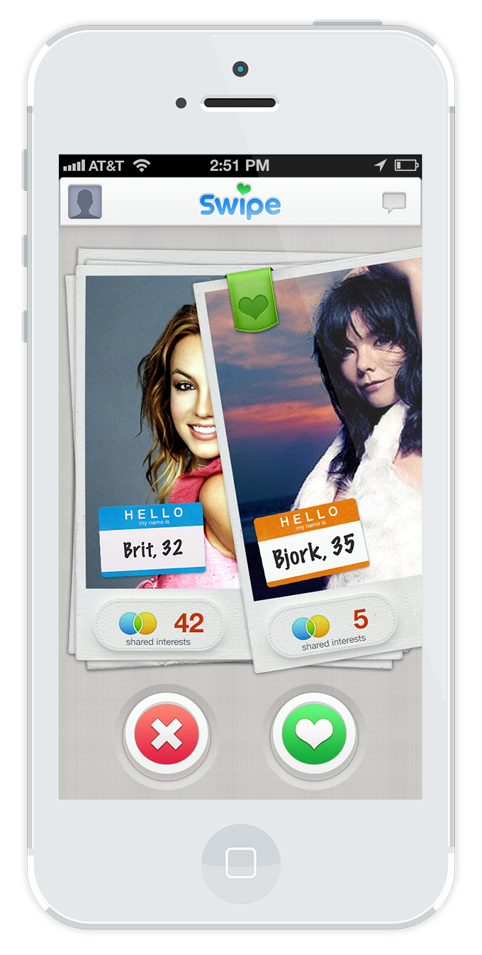
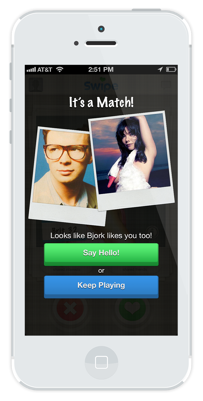
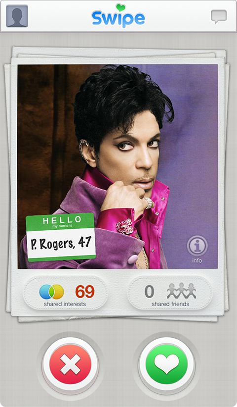
Swipe's Core Loop of love
Although tech-retro by today's standards, I chose a skeuomorphic design to hearken back to a more analog time where matchmaking might have taken place through stacks of photos instead of touchscreens. Textures, like leather, stitches, and paper, were selectively employed in visual elements to add realism and familiarity. Buttons were designed to be friendly and chunky leaving no doubt as to what elements are to be interacted upon.
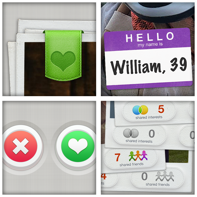
Detail of UI elements
Another novel and noteworthy feature, at the time of development, was the addition of socially-connected friends as "wings." A wingwoman or wingman, of course, is a friend that aids in meeting potential people for amorous pursuits. In Swipe they are first-degree connections able to introduce the user to potential matches within the wing's network.
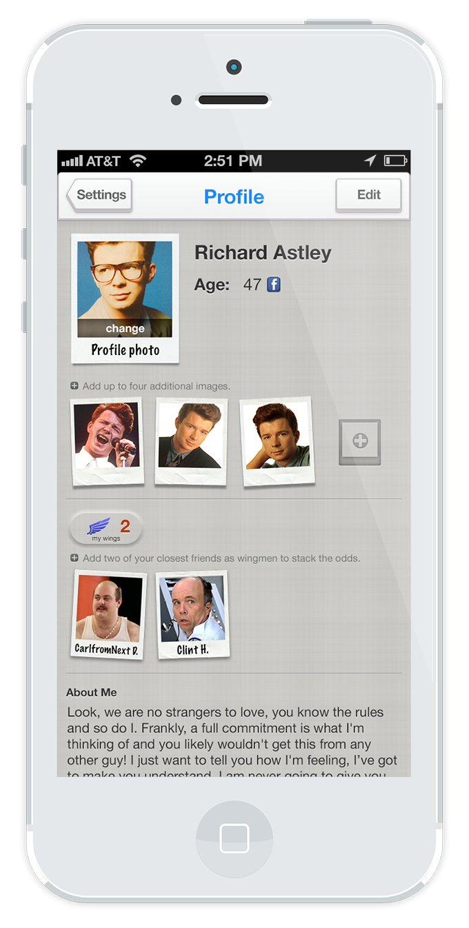
User profile with their wings
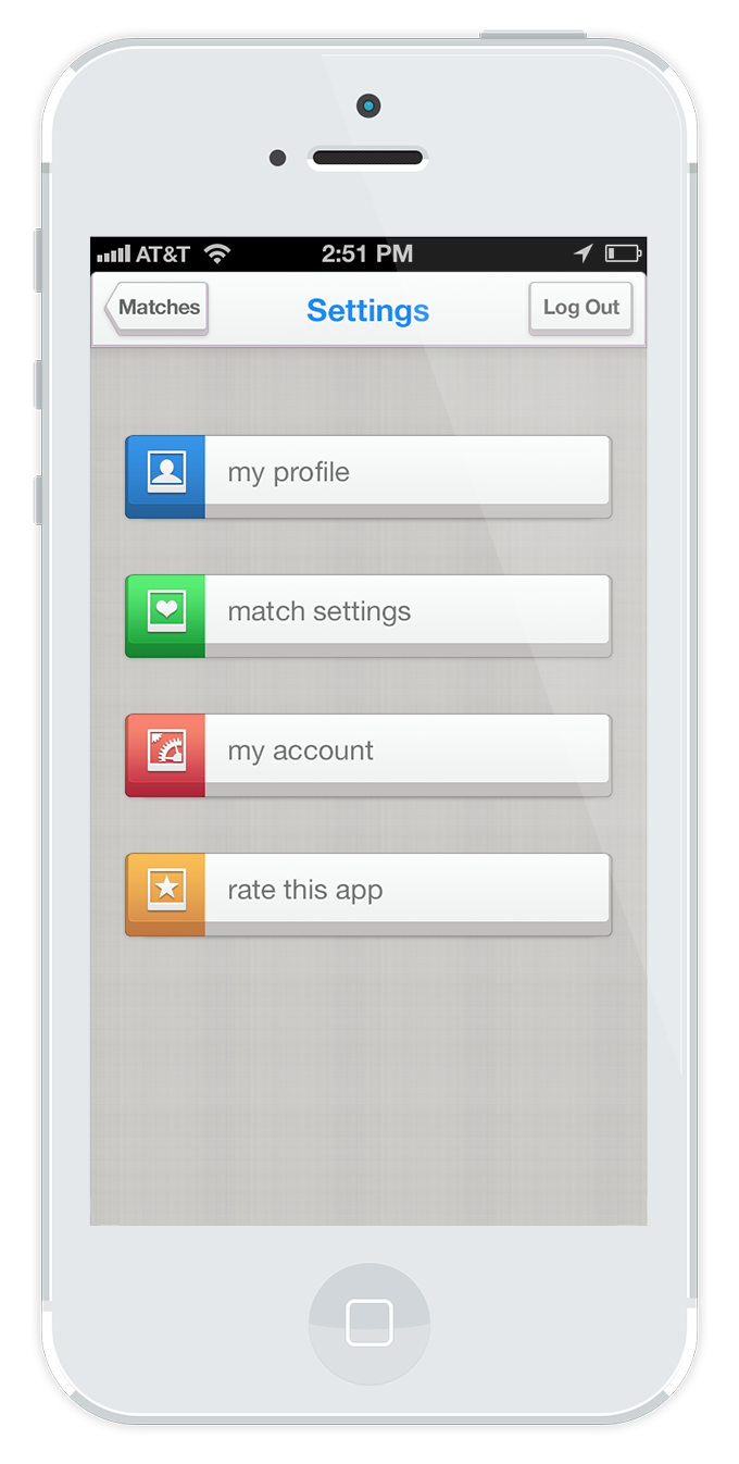
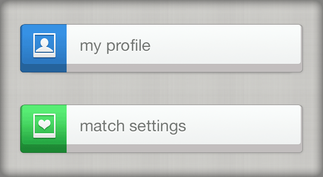
App settings
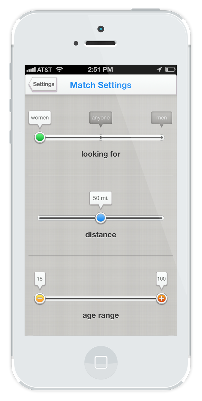
Match settings
Detail of button states
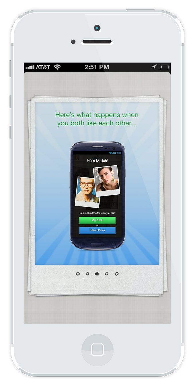
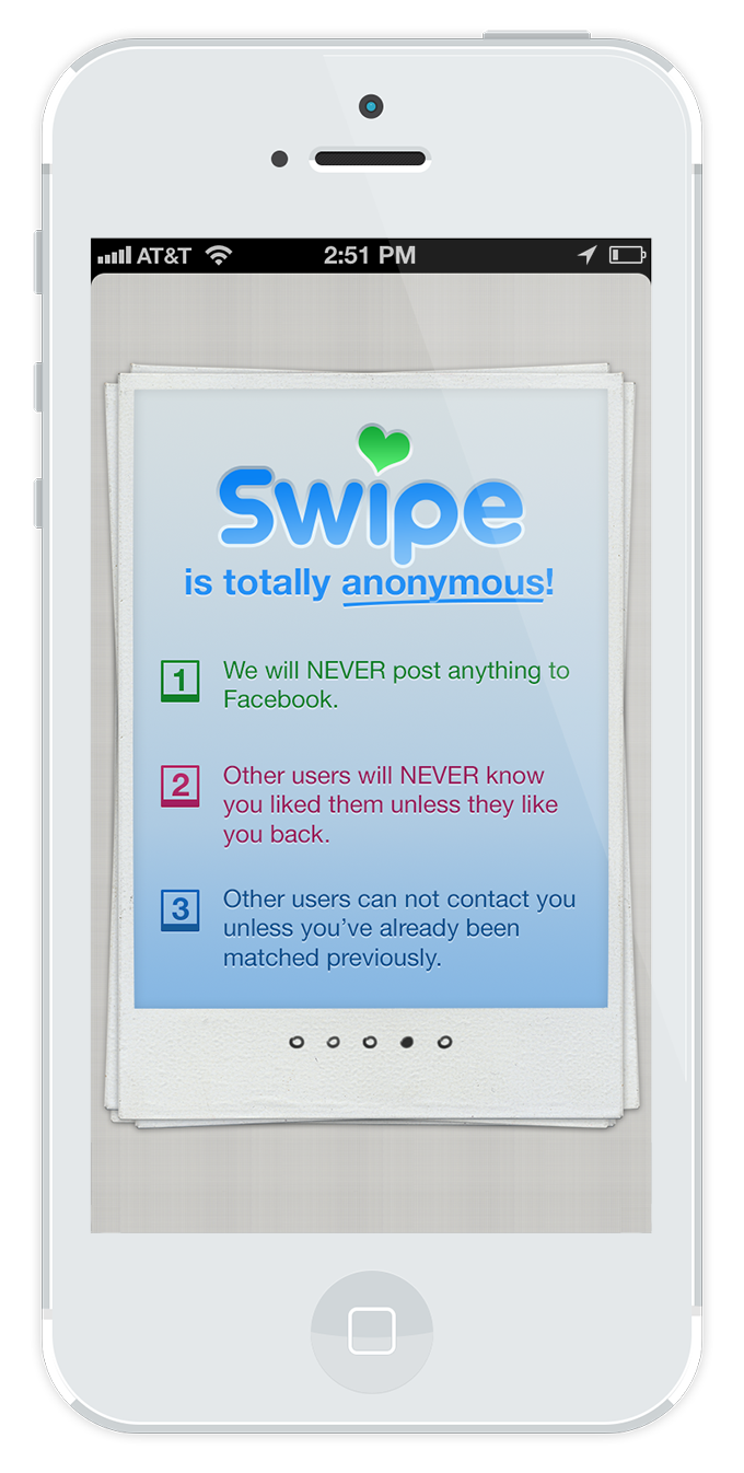
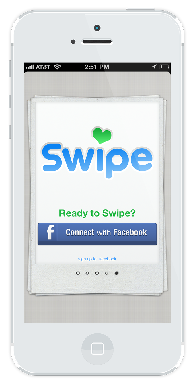
The first time user experience design is a clean, straightforward walkthrough onboarding. Users are instructed through visual cues and minimal text on the basic operation of liking or passing on matches. The final slide features a CTA using Facebook Connect to manage the user's account in addition to populating basic information like name and age to their profile.
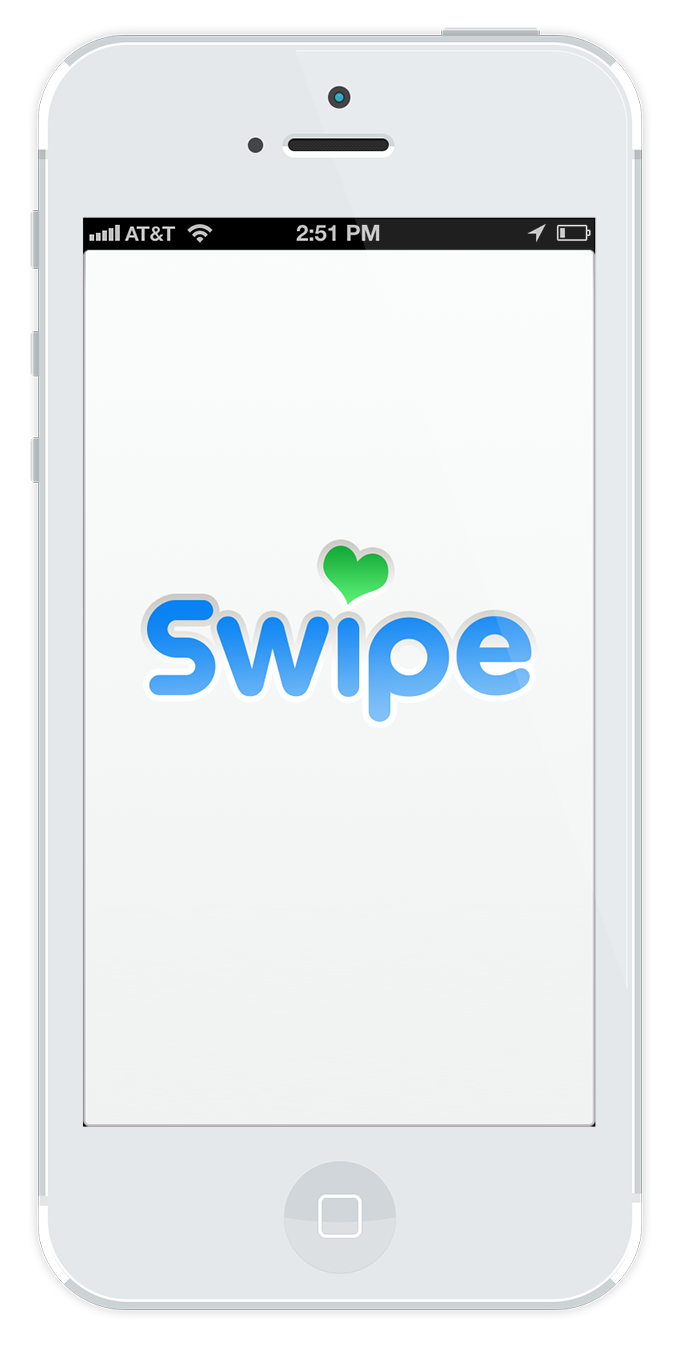
Splash screen
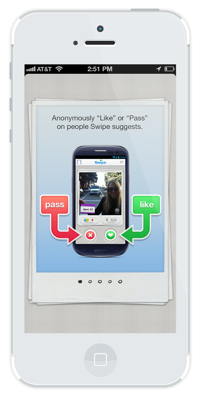
Onboarding 1
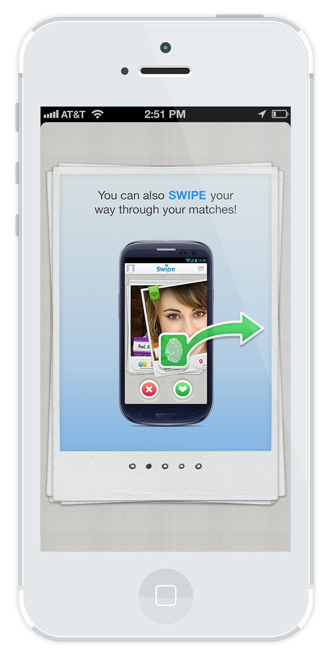
Onboarding 2
Onboarding 3
Onboarding 4
Onboarding 5
Onboarding experience
Additional screens were needed to round out the user experience and catch edge cases and other features, like location services being off, and match searching upon opening. One of these features, for instance, was a limit to daily amount of swipes. Additional swipes, however, would be given as incentive when users invite their friends to join the app.
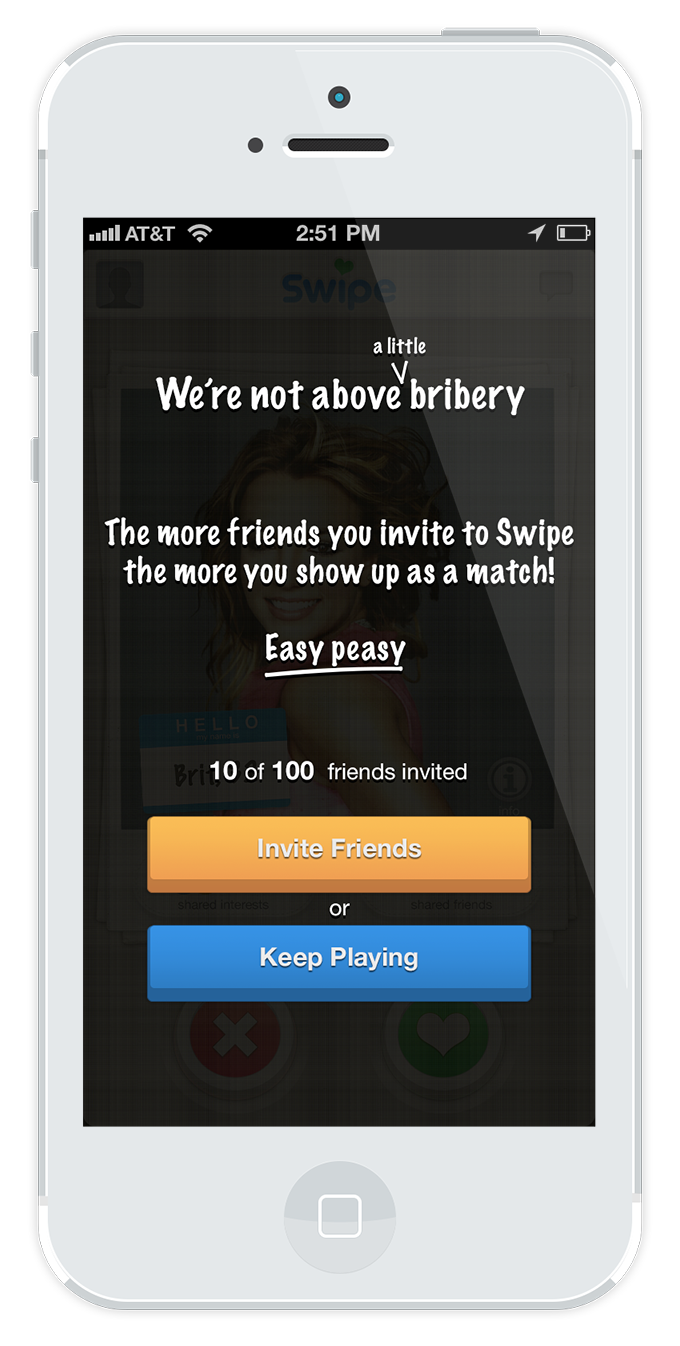
A lickle quid pro quo
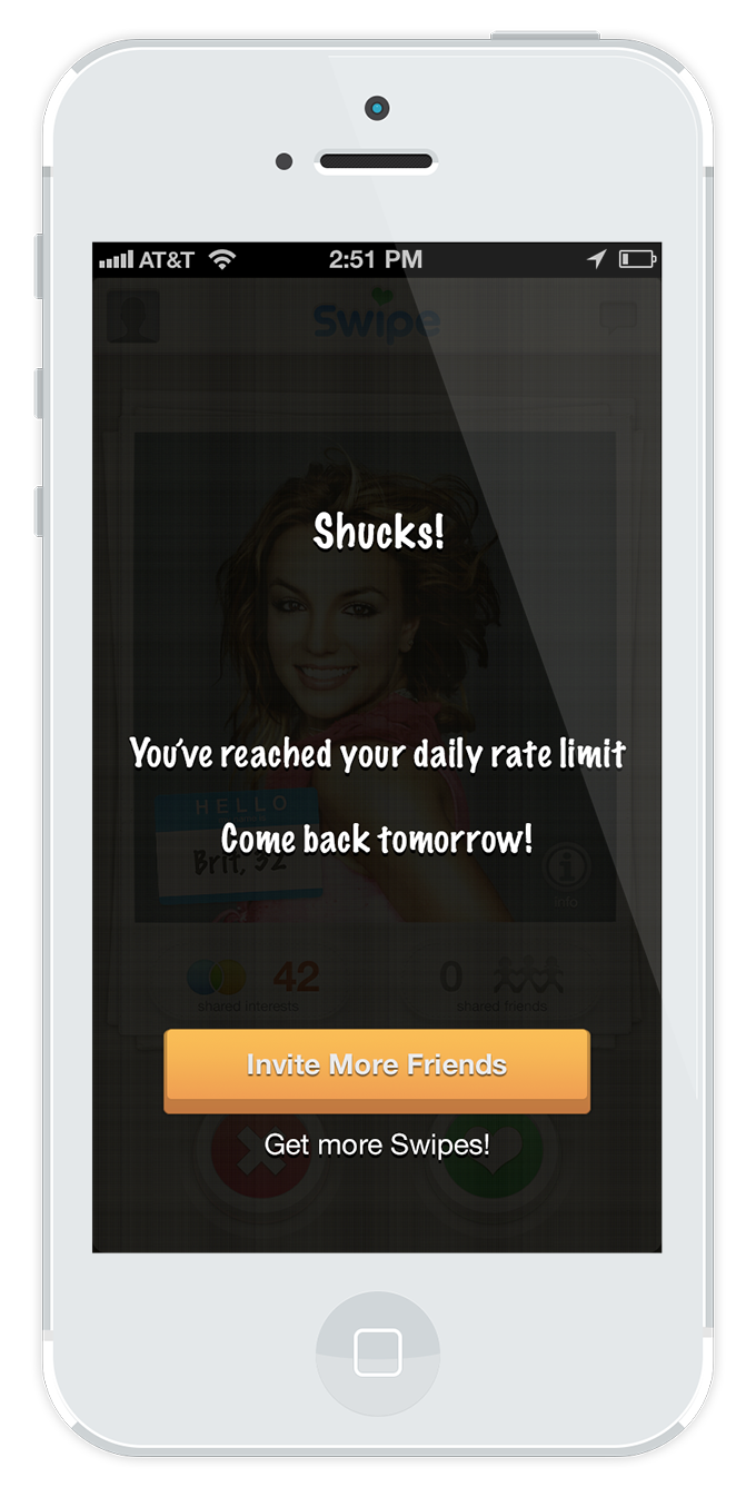
Swipe limit alert
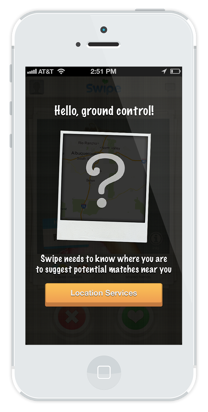
Location service alert
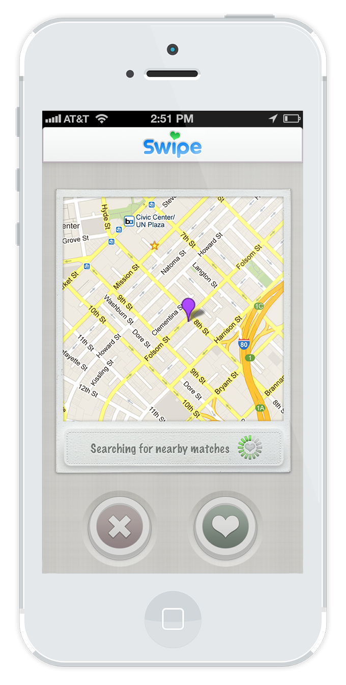
Searching for matches
Edge Cases
Outcome and Lessons Learned
Swipe was a relatively forthright project in its execution and direction. The client's behest was to emulate the industry leader in the dating app space, and as these things go, there is a bit of a balance to be struck between being a clone and innovating to the point of being unrecognizable. In the case of my design choices, I skewed predominantly to the latter, because why mess with clearly proven success? In this, the production was a valuable lesson in selective innovation versus remaining steadfast in what is familiar and comfortable to users. I chose to innovate in the realms of injecting personality to visual style and copy and messaging, because I believe these differences shape experience and, in turn, feeling good.