ux + ui + visual design • art direction
year: 2013 • project length: <1 year • platform: ios/android
Bet Something was an app prototype that was developed and pitched to Zynga. The idea was to facilitate simple, easy, fun social betting with friends. We were also intending to stay within the brand umbrella by leveraging the recent success of Zynga's Draw Something. Myself and a small team of developers from Backbeat Networks were brought on to consult and iterate upon previously begun designs. From that point forward, in addition to UX and UI design, I was also responsible for interaction design, and art contract work management.
Problems to Solve
• Streamline complicated bet-making experience
• Needs to feel like familiar Draw Something experience
Process toward Solutions
The goal of the app was to promote Real Life Exchanges by connecting friends and helping them to play. The desire was to create an evergreen app that capitalized on the universal human nature to bet or compete. One of the primary barriers limiting enjoyment of the experience lay in the complexity of crafting a bet. Preliminary designs suffered from too little detail in the bet crafting interface (as seen below center). As game design complexity evolved and progressed, so too did the addition of relevant information and details needed for memorable bet-making. A later design (as seen below right) demonstrates the desire to have many of these desired elements in one screen, however the final result is overcrowding and a sense of confusion and overwhelm.
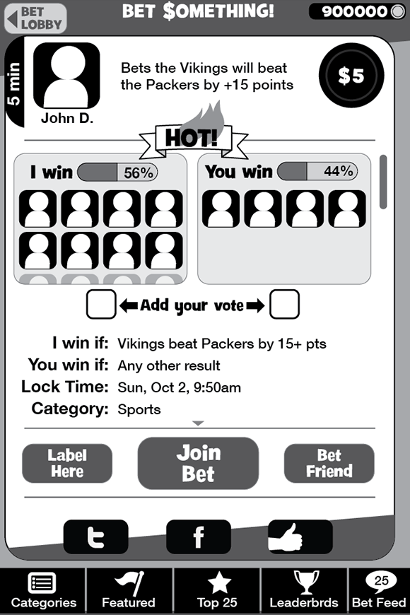
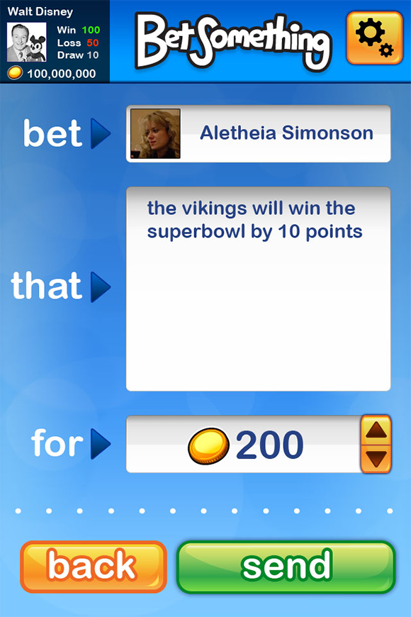
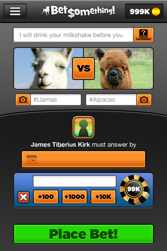
Evolution of the Create Bet interface
The ultimate design solution presents the user with a checklist of clearly-labeled required(or optional) steps to accomplish before placing a bet. This displays all needed information in a linear, easy-to-comprehend checklist format. This clarity in usage can accommodate a wide-range of users with differing levels of technological mastery.
Final Create Bet design
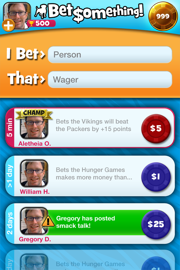
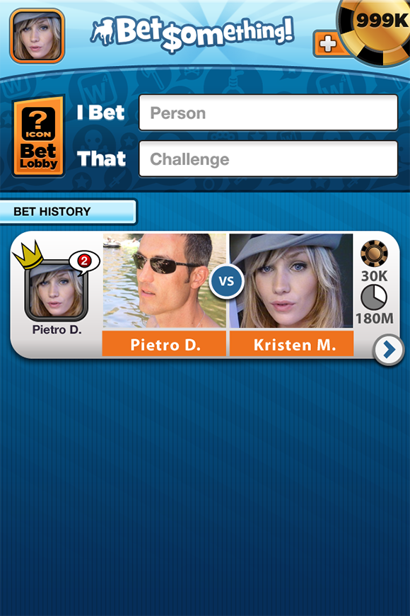
Similarly the current bets screen was suffering from complexity overload in early iterations. These iterations (seen directly below) included two fields to fill. The first for a person to challenge and the second for a wager. As the filling of one would necessitate returning to the current bets UI to fill the other, this proved to be an unneeded step that could be eliminated from the bet creation flow.
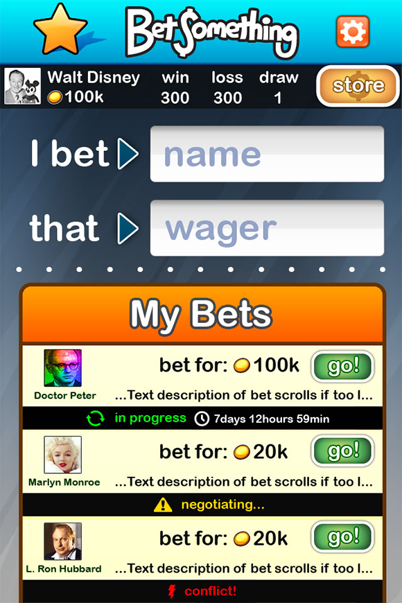
Evolution of the current bets screens
The final Bet Something current bets design borrows significantly from Draw Something's layout, and also features a similar but more sophisticated visual styling take inspired by the predecessor. The two input fields for name and wager, from the old iterations, are replaced with a more straightforward single CTA to bet creation resulting in a neater, better organized, and less cluttered UI.
Draw Something current games interface
Final Bet Something current bets
Continuing the trend and intent of presenting a familiar Draw Something-like experience, I chose very simpatico colors and placement of elements. The friends list below is a prime example of this practice of keeping the faith and injecting differentiation, in this case my objective of evolving the visual style in a way that evokes further maturation and sophistication from what came before.
Draw Something friends list
Final Bet Something friends list
User profile interface
Outcome and Lessons Learned
Bet Something proved to be a challenging project, despite a rather quick timeline for its development. It was a great learning experience working as a contractor within a large and well-supported developmental environment like Zynga. We were a small external team working on-site in tandem with an internal group of Zynga's developers on the Bet Something prototype. Having the Draw Something franchise to riff off of was more a bonus than hindrance, I think. When we were brought on to the project, early developmental and interface design work had already started. The overcomplexity of some of this earlier work contrasts with the simplicity and accessibility found in Draw Something. This ease-of-use and friendliness were driving factors in informing my re-design and subsequent final design work.