ux + ui + visual + web design • art direction + branding
year: 2013 • project length: 1 year • platform: ios/android
I served as art director while I worked at Backbeat Networks, a scrappy 5-human (later 10) tech start-up based in San Francisco. Founded entirely by software engineers, I was brought on (and remained) as the sole creative in the collective. Without a doubt, my stint there was a terrific learning experience as I was forced to wear and learn many hats, and have hands in all kinds of different pots.
Problems to Solve
• Logo creation
• Website creation
• Branding
Process toward Solutions
We wanted a stylish and snappy identity, so first order of business was logo and business card designs. Below are some initial sketches I used to quickly poll the company for feedback. After sorting the results, I narrowed my selections to nos. 6 and 13: a vertical business card motif and a mascot design.
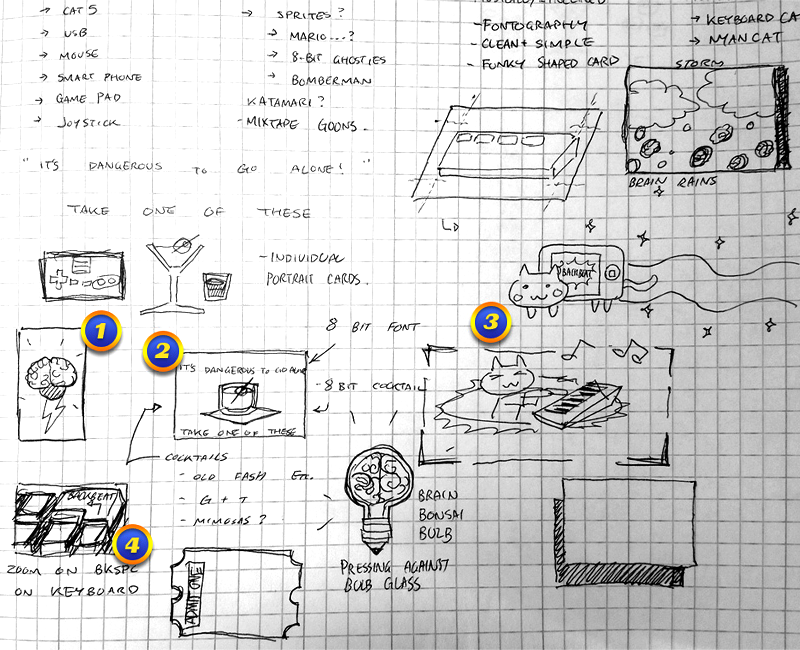
Logo concepts ( 1/4 )
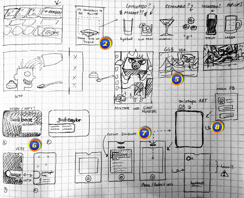
Logo concepts ( 2/4 )
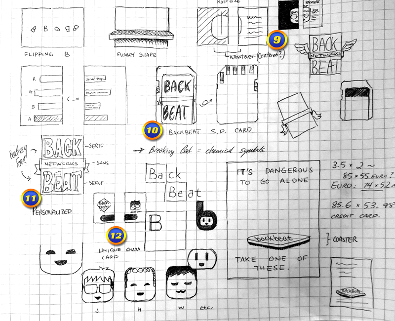
Logo concepts ( 3/4 )
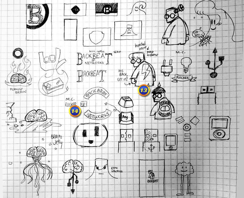
Logo concepts ( 4/4 )
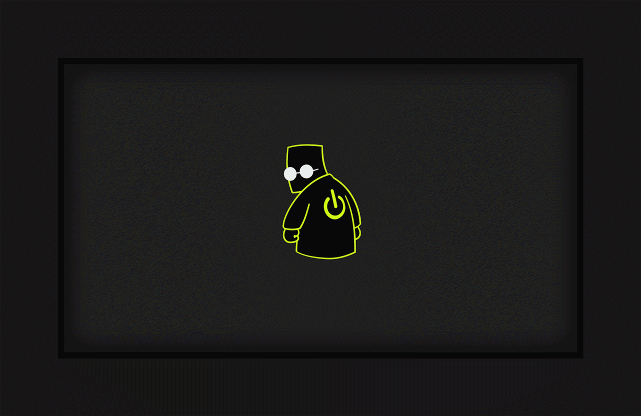
The final logo design consists of a mascot character and typography. Given our company's foundation in engineering and development, my concept for the mascot was a brilliant mad-computer-scientist. Although never having been officially named, he came to be known as Nort around the office, after the notorious Englishman who declared himself Emperor of the United States.
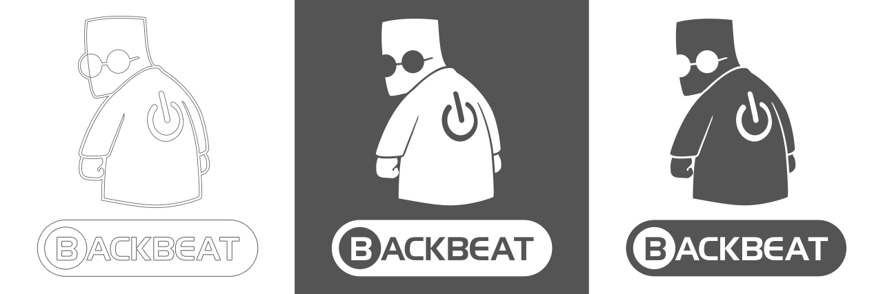
Final logo design
Below, visual continuity can be seen in the color and shape surrounding the type as they connect in unifying both sides of the business card. Rounded corners complement a light curvy typeface, and in the hand or wallet the card shape is distinctive from others. Mod, bold, classy but understated were design goals. Also pictured, an additional variant mascot for female-identifying employees. It would always be a treat to hear co-workers recount the compliments their cards would receive when networking.
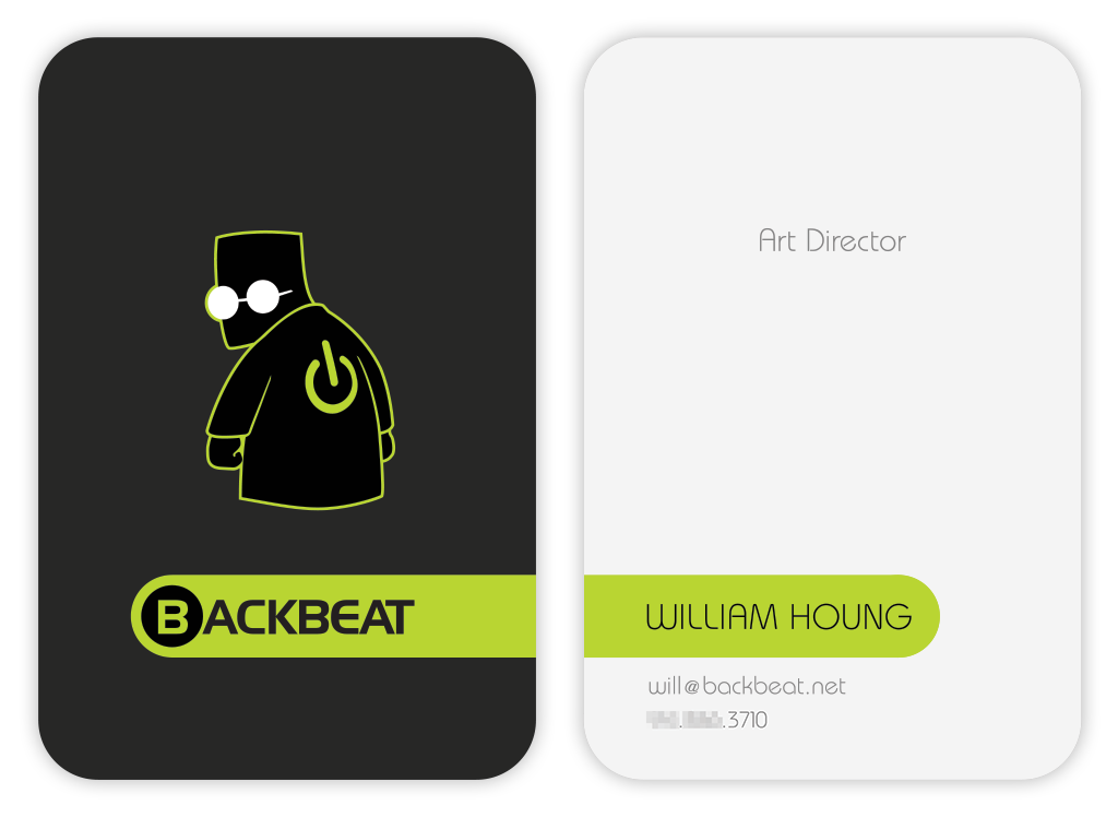
Variation 1
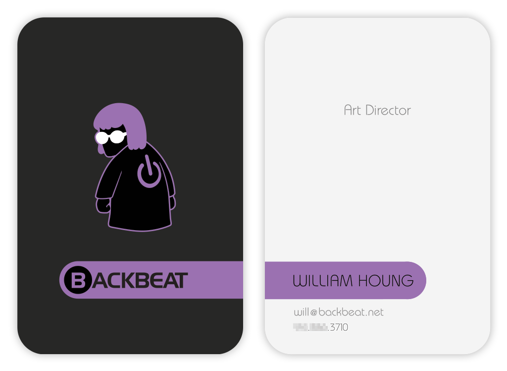
Variation 2
Continuing the theme of boldness in design and color, I set out to design a charming and unique web presence for Backbeat that furthered this exploration. Eschewing the bootstrap designs de rigueur, I instead tried design-thinking inside the box. Thus, each page's contents are literally presented inside a box. Each page featured a major theme color, e.g. gold in the Home page, pink in the Contact page, and so on. Detailed illustrations, animation, and cheeky, winsome touches rounded out the experience.
On a user's first visit, the home page fades in from black. Our mascot stands monumental, powerful amid the heart of an urban landscape. The cityscape in the illustration is a hybrid composed of a number of well-known buildings and features from Pittsburgh, PA and San Francisco, CA, both cities being home to company employees.
Home page [animated]
And who doesn't love electronic mail hurled at them from the bowels of cyberspace? I designed our Contact page to be a kitschy vacation postcard sent fourth-class from the dregs of deepest internet. It features trashy pop memes and randomized catchphrases on the front of the card; and goofy details like an Al Gore postage stamp and delivery (IP) address on the back.
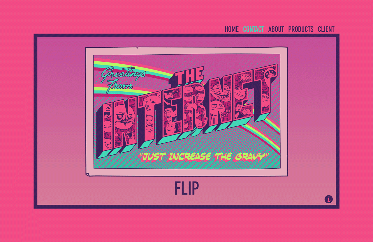
Contact page [animated]
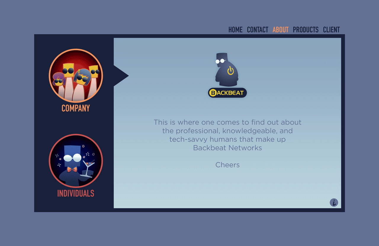
About page [animated]
Outcome and Lessons Learned
Backbeat Networks were an amazing cadre of humans to work with. Despite frequently finding myself involved in multiple projects at once, due to the nature of our size and structure, there was an energizing camaraderie in our shared grind of punching up as an underdog. Creating our brand identity was a rewarding and challenging project. While it can be a difficult to reach consensus when everyone's voices are considered, I navigated the process well and was able to take in and synthesize multiple wants into cohesive final products. Having creative control on these projects meant I could experiment and design in ways I found interesting or unique, and to that end, I think the artifacts delivered.